Thursday, February 7, 2013

storms 5 websites

2.What i saw on this website was a variety of storm pictures.They all had dark clouds and colors blending inside of them.

3.Even though it can be dangerous to take pictures of storms like those on the pictures,you can get some real good pictures from them.

4.

5.A: I chose this picture because i like how the clouds have a dark shade to it but at the same time you can see the light coming from the sky

image stacking 5 websites

2.One of the pictures was in black and white,kind of grayish.It was a water fall,but the effect made the water look like it was kind of drawn and different and foggy.It made the waterfall stand out very dream-like

3.Taking pictures from nature and adding some effect to it can make it look fairy-tale like and different form what you actually expect.

4.

5. A: I chose this picture because i really like how it looks.It gave me kind of a chill/relaxed vibe from it,almost as if i wanted to go there.

B: depth,lines,rules of thirds.The water fall makes the water looks like lines drawn,the picture itself looks like its drawn.The shades makes it have depth.The object is off center.

C:bg2b

Black and White landscapes 5 websites

2. What i saw in these pictures were different landscapes in black and white.They each had a different surroundings in hem or something different in the picture among them.They each had a different angle.

3.In the landscapes the photographer was hesitant about it.Now that i saw them they look really interesting cause usually the colorful views they offer is what makes them stand out and think wow,but with just black and white is pretty unique cause the layers and the shadows that they provide from the effect makes them look amazing.

4.

5. A: I chose this picture because i really liked it.I liked how the photographer took it,the angle.How the peoples's feet hang out making us know from where he took it cause you can see the lake and the little fishing boats.

B: Unique angle he took it from underneath the people so the feet could frame the picture.simplicity kind of cause i mean its just a simple lake but really pretty picture.

C: I thin its John? I'm not really sure.

The dead tree,5 websites

2.What i saw on the website was a variety of pictures of a dead tree in different types of seasons.The photographer was fascinated by this tree so every time a season changed he took a picture of the tree.In every picture,he takes them from different places.

3.I learned that you can take different pictures of one simple object from different angles and still make it look beautiful and unique.

4.(Picture doesn't save) But what the picture looked like was the tree by itself and in the background you can see the other trees from far away making the tree stand out more and in the sky you can see the smoke the airplanes leave and this picture actually has a flare in it coming from behind the tree making the tree look dark and filled with shadows making the grass glow and you can see droplets on it.

5. A: i chose this picture because of the uniqueness in it.A simple dead tree yet the photographer made it a whole big deal and difference.I really like how it looks.

B: Unique angle, avoiding mergers,and rules of third.Cause he made the tree stand out from everything and he took it from a unique angle,he also made the surrounding frame it and the object (the tree) is right in the middle.

C: Kevin Day

Lens flare,5 websites

1.Lens Flare:

2.What i saw on this website was how the light was in the picture.It made it creative and i would really like for some of my pictures to get this effect.The light that came from the sun or just different types of light make the picture a little more brighter and a happier mood for me.

3.A lot of photographers before,when they got this flare thought that it ruined the picture but now that time has changed,photographers think its creative.

4.


5. a: I picked this picture because i like how the light reflects on the grass making the colors blend with each other from the surrounding of the starting of the light(look orange) to the tips of the grass that looks yellow to the end of it that looks green.

B:I see more of a unique angle,cause the photographer took it from the bottom of where the grass stands.

C: "Kissed by the Sun" By MR photography.


Tuesday, February 5, 2013

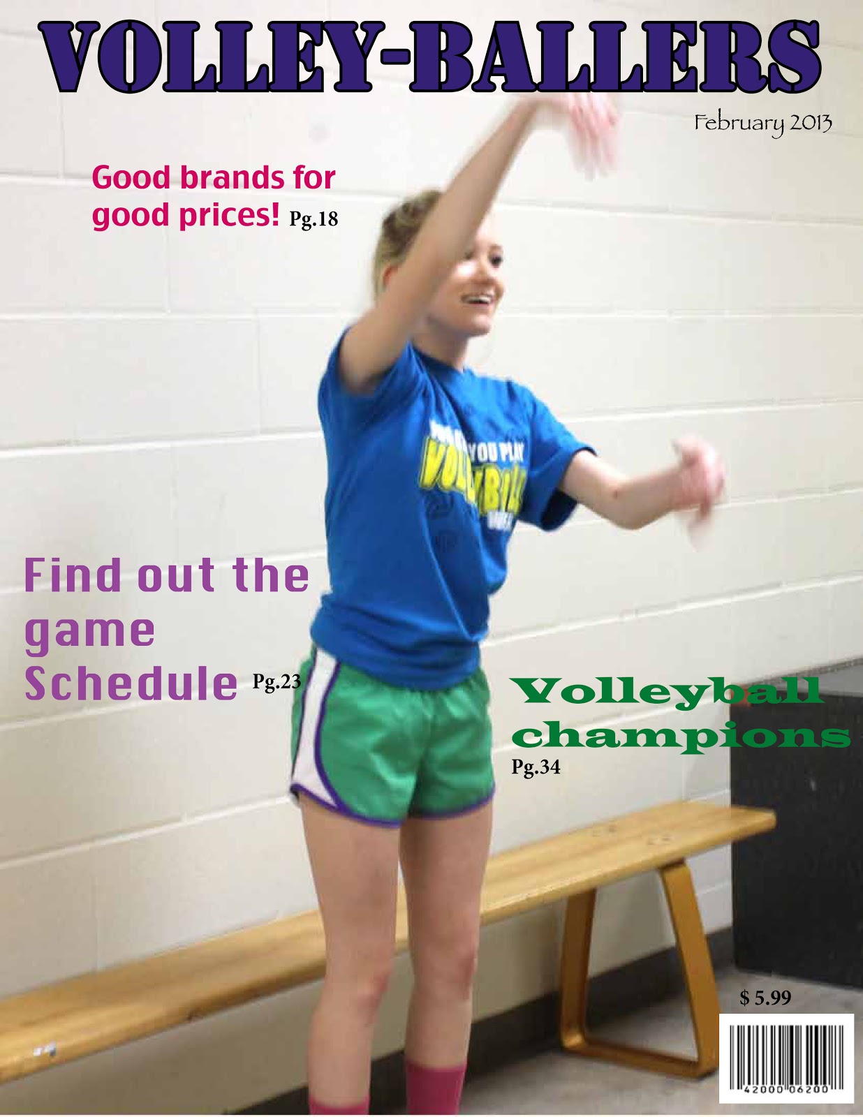
Early magazine cover:

In the early magazine covers they didn't put letters or words that would describe what would be found inside the magazine.The images or just the cover itself were modeled after a book cover,it wasn't models or people but covers of books.Many were dedicated from a book's table of contents.They only provided a tittle and some publication data.

The poster cover:

They were oversized magazines.The authors got the idea of making this oversized magazine covers from art work.Most cover images didn't even relate to a story inside the magazines.The cover's image was just art but in order to go a long with it,they had to put the theme that related to it.The cover just had beautiful artwork or just simply good pictures.The pictures that the covers had were the main attraction to the people.

Pictures married to type:

They were common lines.The authors wanted to attract the reader with a deeper meaning in the covers.They put a poster that actually went with the theme of the magazine.They wanted it to be bold and not show any lines.They wanted it to symbolize something that had to do with the magazine.They wanted a large model with her face overlapping the tittle to attract more people.The placement of everything in the magazine gave it some depth as in colors,objects.This is when they started using models as their cover.

In the forest of words:

This is when they started using more intense colors in the background and in the tittle.They started using more cover lines.The cover lines had to go alone with the cover art.Some magazines even contained cover lines bigger than the tittle.They started putting more nudity in them,not exactly all naked but started showing more skin.Later they started using bold graphic cover with no more than one cover line or they put them in a small size.Cover lines started appearing in front of the models and them in the background.The cover lines surrounding them.They put more cover lines that had to do with what was going to be inside the magazine.

Friday, February 1, 2013

blog #2 best covers (not done)

1.formal
2.Informal
3.formal
4.formal
5.environmental
6.formal
7.environmental
8.formal
9.formal
10.environmental
11.formal
12informal
13.informal
14.environmental
15.environmental
16.formal
17.formal

"Favorite":

magazine tips:Blog #1

5 Things I'm thinking about when i design my magazine cover:

1.choose my colors correctly,like if i want to make it look like the main subject i want on the cover to pop out a little more,i don't want to add too much of something,so make it look like it came like that naturally.

2.Tes it.To try and see it from another persons eye view.Or just simply expose it to people and see if it catches their attention.

3.Find out what type of things people like and dislike so i can get an idea of what would interest them.

4.make the main object i want go along with the background,of course i don't want the background to take the attention of what I want people to focus on but it has to go along with it.

5.See if it looks like it is a real magazine so put it with other magazines.